House Decoration - Difference Between Color and Paints
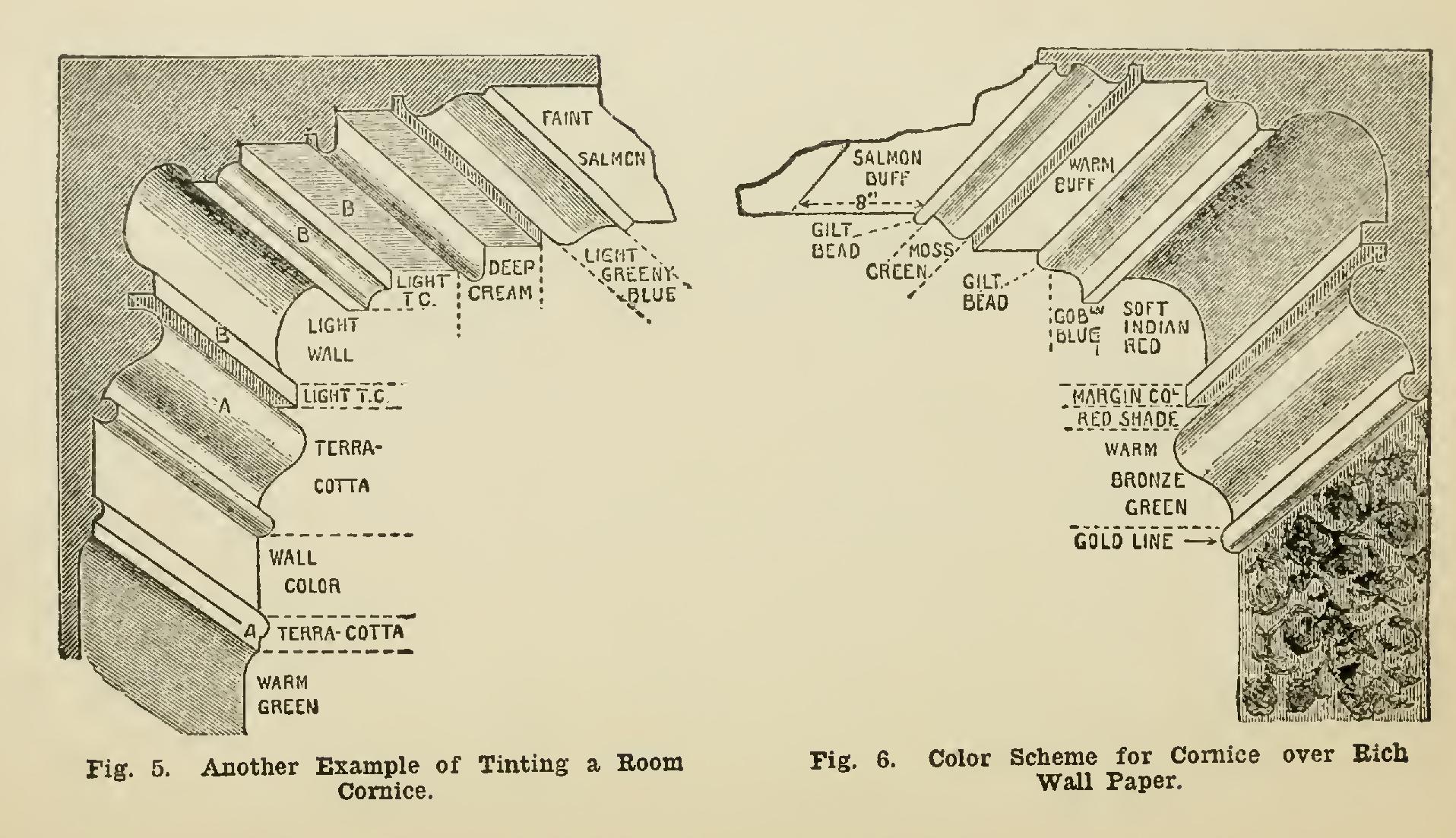
green, white, cornice, little, fig, blue and yellow
The dominant impressions that the primary colors arouse in the mind are briefly as follows: Red gives richness and warmth of sentiment, and ap pears stationary of position when applied to form.
Blue speaks of space and coolness, and will give a re tiring effect to form.
Yellow conveys several sensations, and is most difficult to manipulate successfully; it is considered chiefly an ex citing power, which may verge from high brilliancy and luster to very garish and irritating effects. Beyond this, in its application to form, yellow has a prominent or ad vancing appearance.
Every definite color has its contrast and com plementary—that is, a color in appearance and sentiment directly opposite, but which, when placed in juxtaposition, improves and heightens the effect, and combines so as to produce the feeling of color harmony. In the selection of color for decoration, contrast is therefore one color scheme we may choose.
With various sentiments of color under one roof, satisfactory contrast should exist between them.
The alternative scheme for coloring is har mony, which is produced by employing a gradu ated scale of color.
Owen Jones gave in the year 1852 this dogma or proposition: Color is used to assist in the development of form, and to distinguish objects, or parts of objects, one from another. Mr. but why not pink or green sentiments'? For when seen in a strong light : it is too positive and painful parrying green shades to the usual lighting walls and, being here the principal surface the beauty of color; purity, brightness, and depth of slight tinge of green, which, however, makes it none the less useful and beautiful for the paint er's use. Some writers on the subject credit Prussian blue with the property of fluctuating Ruskin's theory is that the first great principle of architectural color is this: Let it be visibly independent of form.
Since these theories were propounded, much progress has been made in decorative art and coloring, and modern conclusions concerning the relationship of color to form now incline to this: That the two systems, while being quite dis tinctive and separate, may be so combined as to enhance materially the beauty and effect of both.
Here let us turn to Fig. 2, representing the section of a cornice used by Owen Jones to ex plain his theory. In the shade, red is placed to soften its brightness; on the most prominent form, yellow is put to assist its shape; the con cave moulding is colored blue. White intervenes between them on the vertical planes, to prevent one primary impinging on the other. This is really but applying to mouldings the colors best adapted to displaying their shape; it does not secure color harmony even in the cornice itself, and much less in the cornice and the supporting wall. An idea of how far color does assist form may be obtained from Fig. 3, where color is rep resented by shade. The scheme of Fig. 2 is as described above; at Fig. 3 the colors are reversed. Color harmony is still independent of either arrangement.

In sleeping apartments, pure and simple, white must stand pre-eminent as correct expres sion. Nevertheless, many probably prefer the dominant white toned down with a little warmth (red), or soft repose (blue); or, if badly served with Nature's brilliance and strength, we may use a blithe yellow.
The tinting of an ordinary bedroom cornice is represented in Fig. 4; it assumes a bedroom of cold aspect, with the walls hung with a paper in self-tones of salmon-buff, the flat ceiling being distempered a warm cream, made by mixing raw sienna with white. The mouldings next to the paper should be made a warm mossy green, made from ocher, umber, a little ultramarine green (a blue of very green hue), and a little white. The green hue must be very subdued, since the warm walls will bring it out into prominence. A light tint of warm color is put in the cove, which, by reason of the shade, will look a little deeper; this same tint is used on the flat, next the cornice. The mouldings between cove and flat are colored a little lighter tint of moss green, made by adding to the latter some of the ceiling cream-color. If handled with care and judgment, the result will be harmonious and effective, with only three tints of color.