House Decoration - Difference Between Color and Paints
green, colors, red, cornice, blue and yellow
The cornice in its entirety should in all cases form a frame to the ceiling, the darkest color to be at the base, and the tones to lighten towards the ceiling; but the deepest tones should be darker than the general wall-color. Fig. 8 shows a scheme for coloring.
Do not fritter time away in putting twenty colors and shades into one cornice; the eye can not appreciate it, and the effect is lost. To ordi nary view, it destroys the breadth of the cornice. Gilding is properly put only on advanced por tions, and should always be finished off with a coating of clear size.
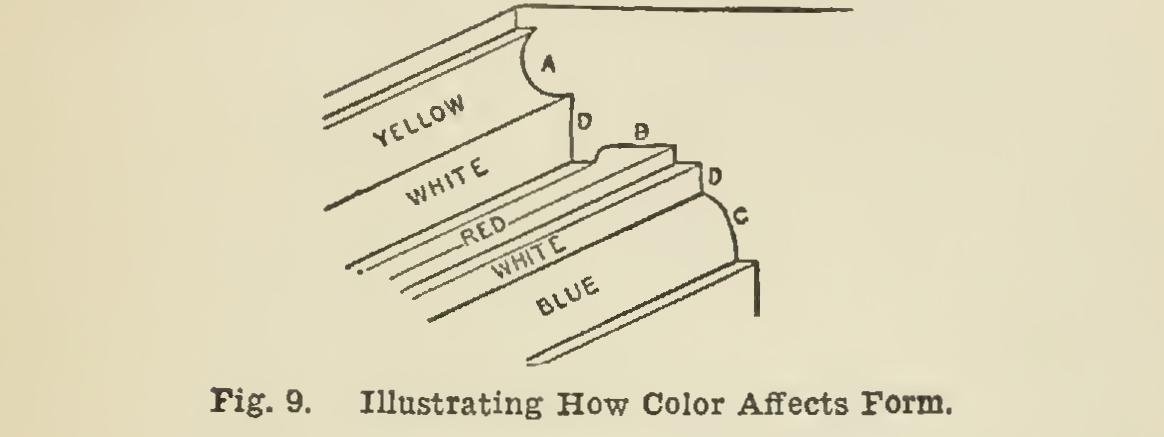
A few lines to form the foundation for prac tice are here quoted from Owen Jones: "It is evident that (in Fig. 9) as the object must be to cause A to advance, it is here we must put the yellow, both from its position and from its form. On the con trary, we place blue at C as the retiring color, and assist ing the concavity of the moulding. Red, the most posi tive of all colors, looks best in shadowŚwe therefore place it at B. The fillets or vertical planes at D, we make white, as useful in separating the colors from harsh con trast. The positions of the colors are subject to modi fication, according to circumstance. Red never looks well when seen in a strong light : it is too positive and painful to the eye: on the contrary, in soffits, in hollows, or depths of any kind, it looks most brilliant. Beyond this, use a faint tint instead of white for all but simple bedroom ceiling flats. Avoid pure or bright colors, especially when they contrast, like blue and yellow, red and green. Mix the tints to a color similar to the wall paper ; then place them somewhat as shown. Avoid much contrast of tone, but give depth." The illustration, Fig. 9, should also be ex amined in connection with this illustration.

In painting a billiard-room particularly, the range of suitable color is governed entirely, and limited considerably, by the vivid green mass of cloth covering the billiard-table, and the accom panying green shades to the usual lighting arrangement. The selection of colors must not clash with, or in the least detract from, the ap pearance of the billiard-table. The dominant
color-tone of a room is usually furnished by the walls, and, being here the principal surface the eye will rest upon after leaving the green table, their appearance is a most important item. In contrasting any shade of green against a warm color, it should be remembered that the green containing most yellow must be opposed by a red having a blue or purple tone, the true contrast of pure red being a decidedly blue hue of green.
The complementary color of the bright green billiard-table cloth is a rich purple-red, the two combined giving a very brilliant effect. Har mony of color and brilliancy of contrasts are not the principal objects in this instance; the aim is rather to soften down the vivid green than to enhance its brightness, which would be done by any shade, however deep, of its complementary upon the walls. The best wall color for the pur pose will be a dull and soft-toned green; and by introducing the warm complementary color into cornice and woodwork, pleasing and harmonious results will be obtained.
Notwithstanding that the principles of color harmony are as definite at those which give us harmony of sound, a knowledge of the exact equivalents of a color will not guarantee the suc cessful color-treatment of a room or building. Scientific equations should form the foundation of color-studies; but the amount of success ob tained will depend upon adapting these definite laws to each particular circumstance and under taking. In addition to the more obvious reasons that are mentioned, the climate and light, the position and interior lighting of the room, and the scenery from the windows, are prominent factors in determining the strength and weak ness of the contrasting tints which compose a harmonious color scheme; and it is under these conditions that mere scientific proportions fail the decorator, and he has to rely upon his own experience and faculty as a colorist.